Prayerhubs
UX/UI & WEB DESIGN
OVERVIEW
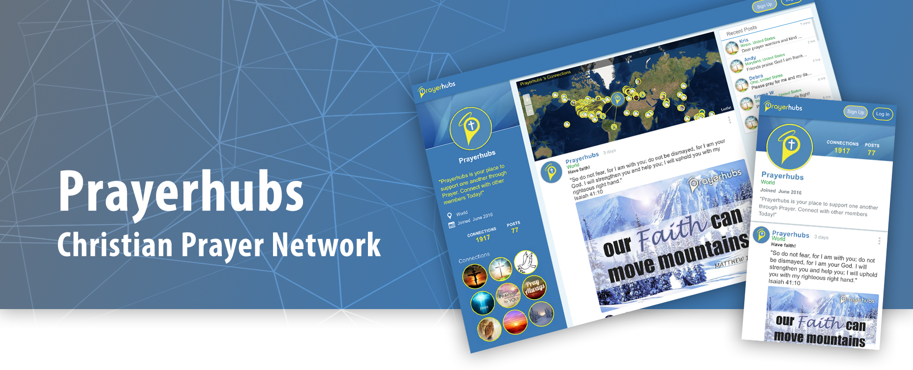
Prayerhubs, a Christian Prayer Network ® ©
Prayerhubs is a platform for online spiritual support for the Christian community. Since its launch in 2016, thousands of new members from all over the world have engaged in this Christian social media website. Prayerhubs members 'connect' with other members to share and post prayer requests, pray for others, post inspirational photos, quotes, and more. Each member has their own Prayerhub; a center point for their posts and Prayer Requests.
Built on a completely customized framework (no CMS/plugins used), Prayerhubs incorporates geolocation as an incentive intended to promote unity and a global connectedness within the Prayerhubs community.
Prayerhubs 2019 v2.1
ROLE
Senior Designer
The Process: research, ideation, user flows, wireframes, prototyping and front-end web development.
TOOLS
Sketch, Invision, Adobe Creative Suite
OBJECTIVE
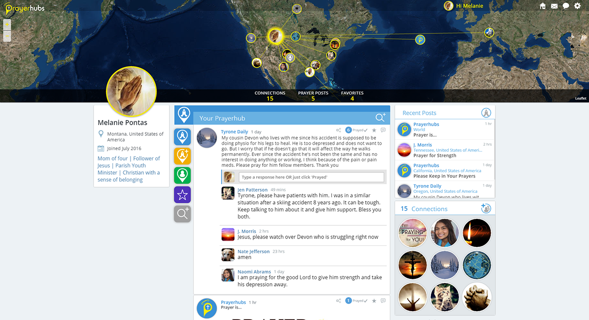
The object was to design an web application that allows users to connect with other members to develop their own Christian prayer network. A map became an integral feature of the website by providing a visual representation of the general location (e.g., province. country) of members and their connections. Members can use the map to see how their prayers are being sent out to reach others around the world.
Both the map and forum are incorporated to generate social activity among members in which primary features will enable them to:
- keep track of their posts
- access and view their connections on the map
- see other member's connections
- invite other members to connect with them
- see only their connections posts
- view their 'bookmarked' posts
- search for members/posts
- message members
APPROACH
Surveys and competitive analysis kick started the planning and research to inform the basic design decisions for this concept. After, personas needed to be established to gain an understanding of the user's motivations, goals and pain points. Then ideating by creating user flows and concept ideas followed to map out how the user will travel through the site. The design phase will involve sketching out and building lo-fidelity wireframes for landing pages, log-ins, mainframes, etc. then iterating to get it right.
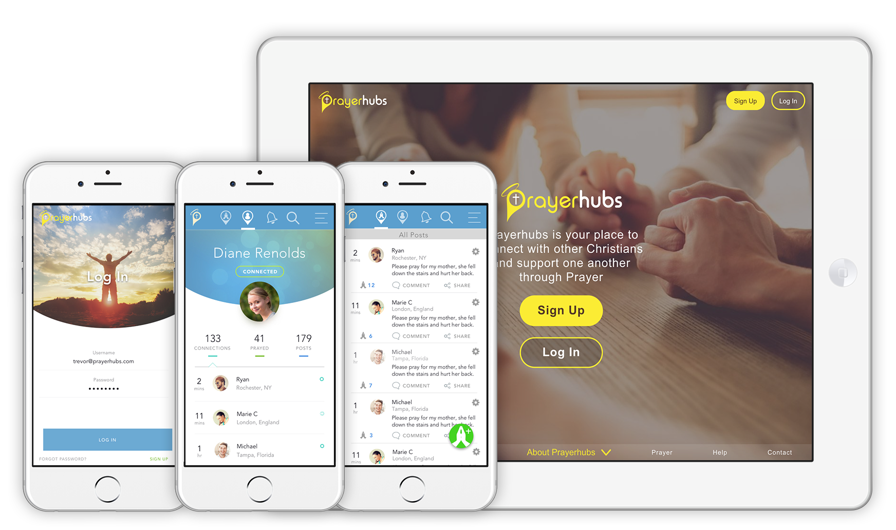
Although many modifications have been made since, here is a peak of one of the earliest versions with the Prayerhubs map:
2016 version 1.0 interface with the Prayerhubs interactive map.
VERSIONS
Within a year of development, major changes to the mainframe and UI were made. The map became smaller, allowing main features to be more visible upon page load an before scrolling. The layout adjusted according to screen size as depicted in the image below. The colour scheme changed, switching to a a more simplified palette. Prayerhubs was redeveloped to be more responsive and fast in v2.1. More features were added, removed and modified.
Take a look at the some of the changes below…yet still many major UX/UI changes since then which we'll look at ahead.
2017 v2.1 interface with the Prayerhubs map.
{THE PROCESS}
RESEARCH
As I began my research on this major project, my initial task was to gain insight into the competitors on the market. The objective was to analyze their strengths and weaknesses in areas that aligned with similar goals the Prayerhubs users would have and the tasks they would accomplish.
I performed a competitive analysis of four prayer requests apps and websites. The main goal is to post a prayer request but having an understanding of other related features that improve the user's experience was key.
Competitive Analysis
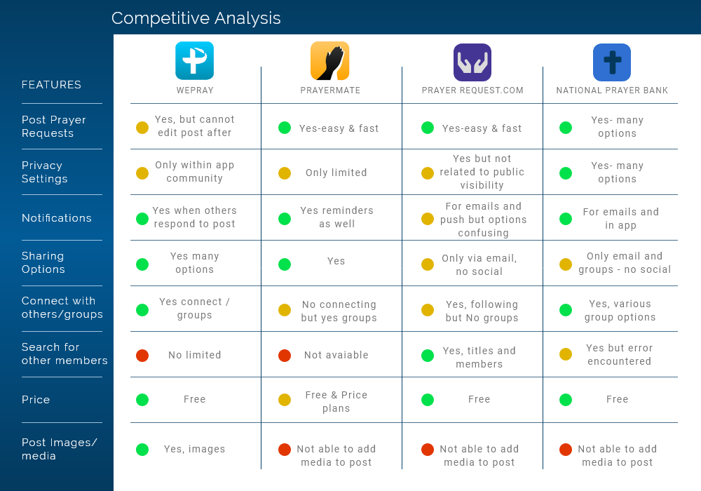
Competitive Analysis Results
The features that I compared were relevant to the main features that were projected to be in the Prayerhubs web app. I was not surprised by the range of options for notification settings in the comparisons. This leads me to think that in app and email notifications would be vital for retention and developing brand affinity. Connecting and following other members were features to strongly consider moving forward.
Research Insights
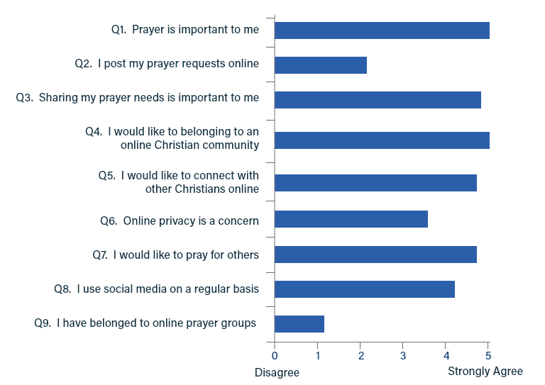
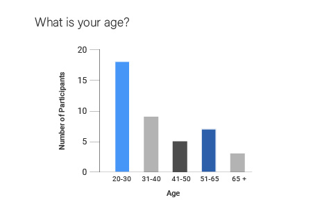
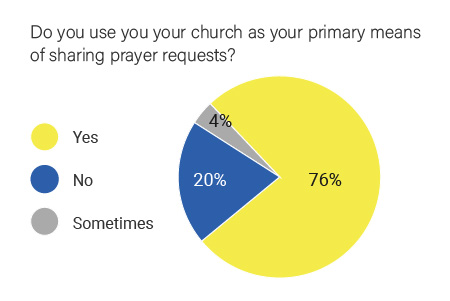
I received 42 completed paper questionnaires that I provided at various churches around the GTA. The samples above indicated that individuals (at time of questionnaire) relied mainly on their church for sharing prayer requests with others.
Not surprisingly, all felt that prayer and connecting with other Christians was important to them. Overall, the results lead me to rethink my designs to focus on user connections, user privacy controls and emphasizing a spiritual community. The primary age was roughly 25 which will represent my target audience as depicted in the user persona.
ANALYSIS
Empathizing and Understanding
User-centered design is key to Prayerhubs so designing a system based upon social interaction where members can 'connect' with one another was key.
Prayerhubs is targeting the Christian population, specifically those who utilize the internet to share prayer requests, look for spiritual support and want to belong to a Christian community. While all ages are expected to use the website, my focus was be on an audience that engages in social media in the strongest Christian sectors in the US, the Bible belt.
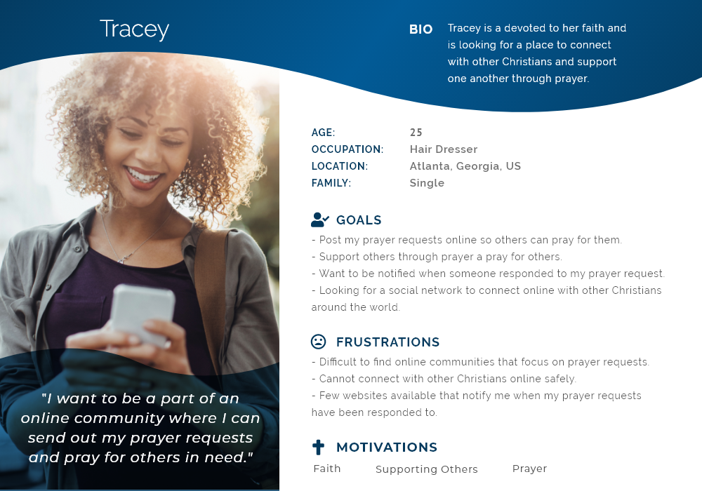
User Persona
Empathy Map
Based on the user persona, I created an empathy map to better understand their needs and goals, so that I can know what the main issues are that my designs needed to solve.
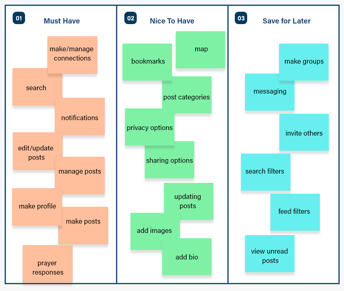
The empathy map helps me narrow down their needs and wants which then help me to define the MVP:
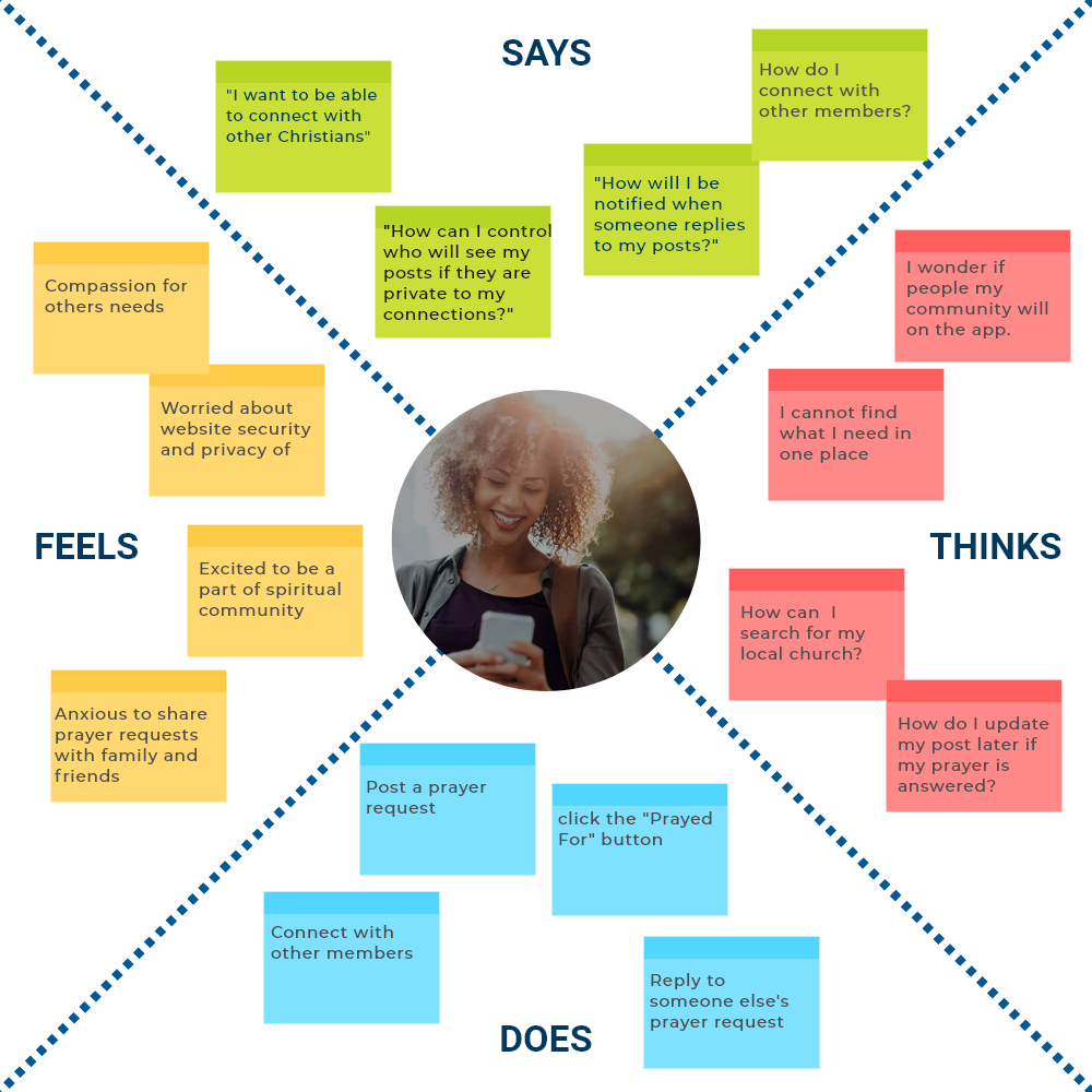
Understanding the user’s needs helps me to define the MVP.
Summary of the empathy map:
- Post a prayer request and update it later if need be.
- Connect with others easily online.
- Be notified of when someone replies or prays for their request.
- Can search for other members, including their church.
- Have control over who sees their posts via privacy settings.
USER SCENARIOS
This user scenario helps me to build a better picture of the features needed and the user flow based upon the use cases of the Prayerhubs members.
Scenario 1
- 1. Tracey finds out her uncle is going in for surgery and wants to let the members of her church know so that they can pray for him.
- 2. She posts a prayer request on Prayerhubs for her uncle.
- 3. The members of her church receive notifications of Tracey's post about her uncle and respond to her prayer request post.
- 4. Tracey is grateful for the spiritual support received from her connections on Prayerhubs.
Scenario 2
- 1. Tracey tells her friend Andrew about Prayerhubs so he decides to check it out.
- 2. She posts a prayer request on Prayerhubs for her uncle.
- 3. Andrew uses the search feature to search for Tracey on Prayerhubs and happily sends her a connection request.
- 4. Tracey is notified of Andrew’s connection request and accepts it.
- 5. Andrew feels comforted seeing Tracey’s posts in his feed and her profile image displaying in his list of connections.
- 6. Andrew replies to Tracey’s post and is excited about connecting with others.
{PROBLEM STATEMENT}
There are few social media platforms created that solely center upon sharing prayer requests. People need a way to share their prayer requests immediately with friends and loved ones and know that others are praying for their needs.
IDEATION
HWM Statements
After combining and summarizing the user needs and pain points into a Problem Statement, I then turned to the HMW (How Might We) to help me to create solutions that can be directly converted into features.
- HMW let members connect with other members.
- HMW provide an online community for support.
- HMW help users stay notified of responses to their posts.
- HMW present privacy options.
- HMW provide a way to bookmark/favorite member's posts.
- HMW provide ways to search for other members.
- HMW provide a way for member's to manage their posts.
Sorting the Features
Once the user's needs were defined, I tabulated features that would allow user's to accomplish their goals and complete their primary tasks.
User Flow
I created a user flow diagram to plan out the path a Prayerhubs user will take based upon their goals. The map works with the main feed to project the user's profile. That is, the map displays the location of the user and their connections on the map at the same time as their posts, connections and profile info (e.g., name, location, Bio, profile image). The feed changes according to the member being viewed.
Early questions involved asking 'what does the user want to do once they get to Prayerhubs?' How does the user create a new post, how would it be displayed, responding to other member's posts, connecting with others, etc. What are their goals and what tasks do they want to accomplish?
The user flow demonstrates how users can navigate to other's member profile pages (i.e., their prayerhub) in a variety of ways. Once there, they can opt to connect with them by sending a connection request.
If a member is not connected to the user, a 'Connect' button will be visible. If they are already connected, the button text displays 'Connected'.

Prayerhubs User Flow Diagram
If a member is not connected to the user, a Connect button will be visible. If they are already connected, the button text displays 'Connected'.
The user's Prayerhub page features the main feed which works like a tabs feature so that the information is always displayed in one location but changes according to which button is selected. The main feed displays:
- All members posts
- 'My posts'
- 'My Connection's posts'
- Search
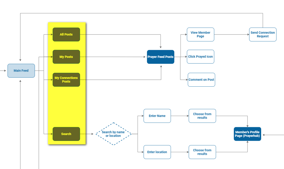
The components of the main feed (highlighted).
DESIGN
Designing the Prototype
With a clear idea of the main features, it was time sketch out fast iterations of the wireframes before jumping into the mid-fidelity prototypes. I generated ideas, made revisions while continually referring to the user flow.
One of the many early roughs outlined (below) how the feed would be laid out on mobile as opposed to the desktop view. The main user icons emphasized only the fundamental functions such as creating a new post, all posts, my posts and profile settings. Desktop views expanded to display the user profile and widgets.
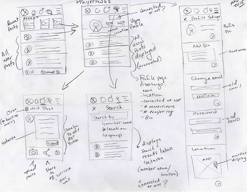
One of the early rough sketches for the main screens (2015).
Mid-Fidelity Prototypes
Once the sketches were finalized, it was time to design the mid-fidelity prototypes for testing. I used Sketch to define the overall structure of the main screens which depicted the layout of content, features and interactive elements.
I often went back to iterating through sketches and then back to prototyping to make changes.
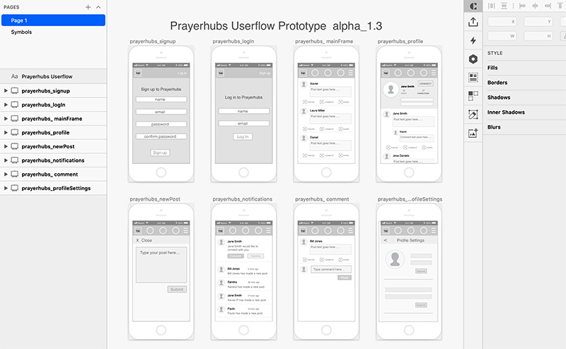
Sample of v1.3 Lo-Fidelity wireframes
VISUAL DESIGN
I wanted to keep the interface simple and minimal and inviting. Colours inform the user what he/she can interact with and where the important pieces of information can be found. Subtle use of soft gradients draw attention to widgets.
I used the colour blue as the main colour, because blue evokes feelings of calmness and spirituality as well as security and trust.
Colour Scheme:
#07639E
rgb (7 99 158)
#FCED00
rgb (252 237 0)
#06CE65
rgb (7 206 101)
Typography
Now that the wireframes are completed, and I have a clear understanding of the main structure of the website, it was time to move on to the visual aspects of the interface.
I chose Roboto because it's a simple and easy to read typeface. I wanted to keep in mind that individuals with vision and cognitive impairments require certain typographic considerations be made during web design and development that affect design choices.
{ H1 } Roboto - Bold
{ H2 } Roboto - Medium
{ H3-H6 } Roboto - Regular
{ titles } Roboto - Condensed
{ body text } Roboto - Regular
A B C D E F G H I J K L M N O P Q R S T U V W X Y Z
abcdefghijklmnopqrstuvwxyz
Brand Identity
My goal here was to make the logo simple, legible, easy to read. I incorporated a map marker into the “P” along with Christian elements such as a halo and cross as visual identifiers for icon and favicons use.
Original Logo Designs
Original Logo

Original Logo Icon
The logo was revised from its original state to be more playful and welcoming. Again, for this, I had to consider colour/contrast, font-size, spacing/proximity in all areas of the design.
Final Logo Designs
Redesigned Logo
Redesigned Logo Icon
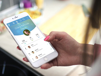
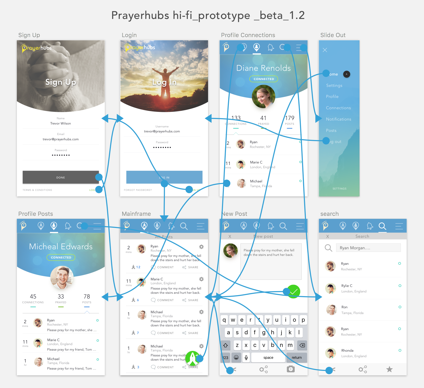
High Fidelity Prototype
With the immediate features realized (e.g., new account and profile set-up, posting, connect with other members, etc.), the UI was designed and interactions were added to high-fidelity prototypes for testing. Making changes to the prototype saved valuable time before the hard coding began.
Design challenges:
My main challenge was conceptualizing a responsive framework that would scale to any screen size. Essentially, the UI had to transform form from mobile (looking like an app) to table then desktop view. To solve this problem meant that features had to be divided into 3 main sections:
Section 1: User Profile (left)
Section 2: Map/Main Feed (middle)
Section 3: Widgets (right)
Grouping content into three main sections allowed for easier scalability and adaptation to screen size. On mobile view, only the main feed is displayed (section 1) but a button was added to the header to view the user profile (section 1). Widgets (section 3) were omitted but eventually incorporated into the feed a few years later. On tablet and desktop view, all three sections are visible.
FINAL DESIGNS

The layout is divided into three sections to adapt to any screen size.
THE TAKE AWAYS
Retrospective design considerations
- The more user research to start the process the better. Comparing apps/websites, conducting interviews, user testing, creating personas, etc. is vital to understanding the design process.
- Designing for MPV is crucial for testing early designs. Many ideas can creep into projects putting pressure on the scope. Remember to keep things simple at first. Adding features slowly will make testing easier and development less complex.
- Communicate with stakeholders earlier and regularly.
- If time allows, design for a variety of user scenarios to refine features and improve usability. The more you understand the goals of your user and how they will use your product, the more time you will save designing appropriate features and user flows.